
Why Your Kajabi Website Looks Fine But Isn't Converting (And How to Fix It)
Aug 19, 2026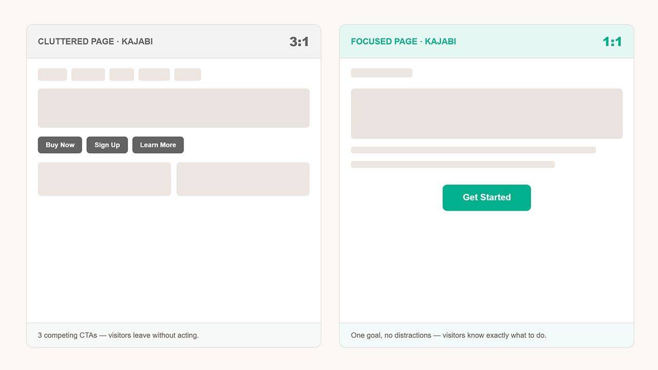

Dianne Empeynado
Vetted Kajabi Expert | Website Designer
Where sleek design meets bulletproof tech & support.
Last updated: September 12, 2026
A Kajabi website that looks polished but isn't converting is almost never a design problem, it's usually unclear messaging, competing or missing calls to action, buried trust signals, or a Kajabi-specific setting (like checkout type or redirects) quietly working against it.
Your Kajabi website looks good. The colors are on-brand, the photos are professional, the layout is clean. And yet the leads aren't coming in, the offer isn't selling, and the inbox stays quiet.
Here's the part most people miss: looking good and being persuasive are two different jobs. A website can be visually polished and still lose visitors at every step, because conversion problems are almost never design problems, they're clarity problems, trust problems, or friction problems wearing a design problem's clothes. And on Kajabi specifically, some of the biggest leaks aren't visual at all, they're sitting in a setting most people never open.
I've spent years inside Kajabi, first on Kajabi's own Technical Support team, then as a VIP Implementation Specialist, before becoming a vetted Kajabi Expert. I don't just ask "does this look nice?" I look at how a site actually behaves: where visitors get confused, where the offer and the page stop matching, where the platform's own settings are quietly working against you.
Key Takeaways
- A polished-looking Kajabi website and a converting one are solving two different problems, design answers "does this feel credible," conversion answers "does this get a specific visitor to act right now."
- The most common conversion killers: unclear messaging, competing or missing CTAs, buried or generic trust signals, unintended exits, confusing navigation, decorative images that don't reinforce the message, a weak mobile experience, and an offer-page mismatch.
- Several conversion leaks live inside Kajabi's own settings, checkout type, redirects, form confirmations, page speed, not in the visual design at all.
- Run the audit checklist below before assuming you need a full redesign. Most fixes are structural, not visual.
- Not sure what to do with what you find? There's a clear next step for that below.
Jump to a section:
- "Looks Fine" and "Converts" Are Two Different Jobs
- Design for the Real Goal, Not Just the Website
- The Real Reasons a Kajabi Website Doesn't Convert
- How to Audit Your Kajabi Website for Conversion
- Kajabi-Specific Things That Quietly Kill Conversion
- Design Fixes vs. Strategy Fixes
- What to Do Next (And Why to Hire a Vetted Kajabi Expert)
- Frequently Asked Questions
"Looks Fine" and "Converts" Are Two Different Jobs
Design answers the question: does this feel credible? Conversion answers a harder question: does this make a specific person take a specific action, right now?
Peep Laja, founder of CXL and Speero and one of the most cited names in conversion research, built his career on a simple idea: CRO is roughly 80% research and 20% experimentation, understanding your visitor before you touch a layout, not guessing at what "looks better." A website built purely from aesthetic instinct can hit every design trend and still miss the one thing that actually moves a stranger to act.
That's the whole-funnel version of this problem. At the individual page level, Oli Gardner, co-founder of Unbounce, has spent years diagnosing exactly why specific pages fail, and two of his ideas explain most of what goes wrong on a Kajabi page. You'll see both again in the sections below.
Between Laja's research-first mindset and Gardner's page-level diagnostics, the common thread is the same: the design was the priority. The persuasion architecture, the thing that actually turns a visitor into a client, was an afterthought, or never planned at all.
Design for the Real Goal, Not Just the Website
Chris Do, founder of The Futur, puts it bluntly: a client rarely wants a website. They want to sell a product, generate leads, or build awareness, the website is just one vehicle for getting there. When a project starts with "I need a website" instead of "I need more clients booking calls," the design ends up serving the wrong goal from day one.
Do teaches creatives to be diagnostic before proposing a solution, asking what the client is actually trying to achieve, instead of showing up with a pre-baked answer. Applied to a Kajabi site: the real first question isn't "how do we make this page better?" It's "what is this specific page supposed to make someone do, and does every section serve that one job?"
That question exposes a lot. A gorgeous "About" page that doesn't lead anywhere is decoration. A hero section that describes your credentials instead of the visitor's problem is decoration. Even a beautifully designed offer page can fail if it was never built around the outcome the visitor came for.
The Real Reasons a Kajabi Website Doesn't Convert
Here's a quick-reference summary before the full breakdown below:
| Conversion Killer | Why It Happens | Fix / Related Audit Test |
|---|---|---|
| Unclear or generic messaging | Homepage headline doesn't say what you do, who it's for, and what to do next within about five seconds | The 5-second test, show your homepage to someone unfamiliar with your business |
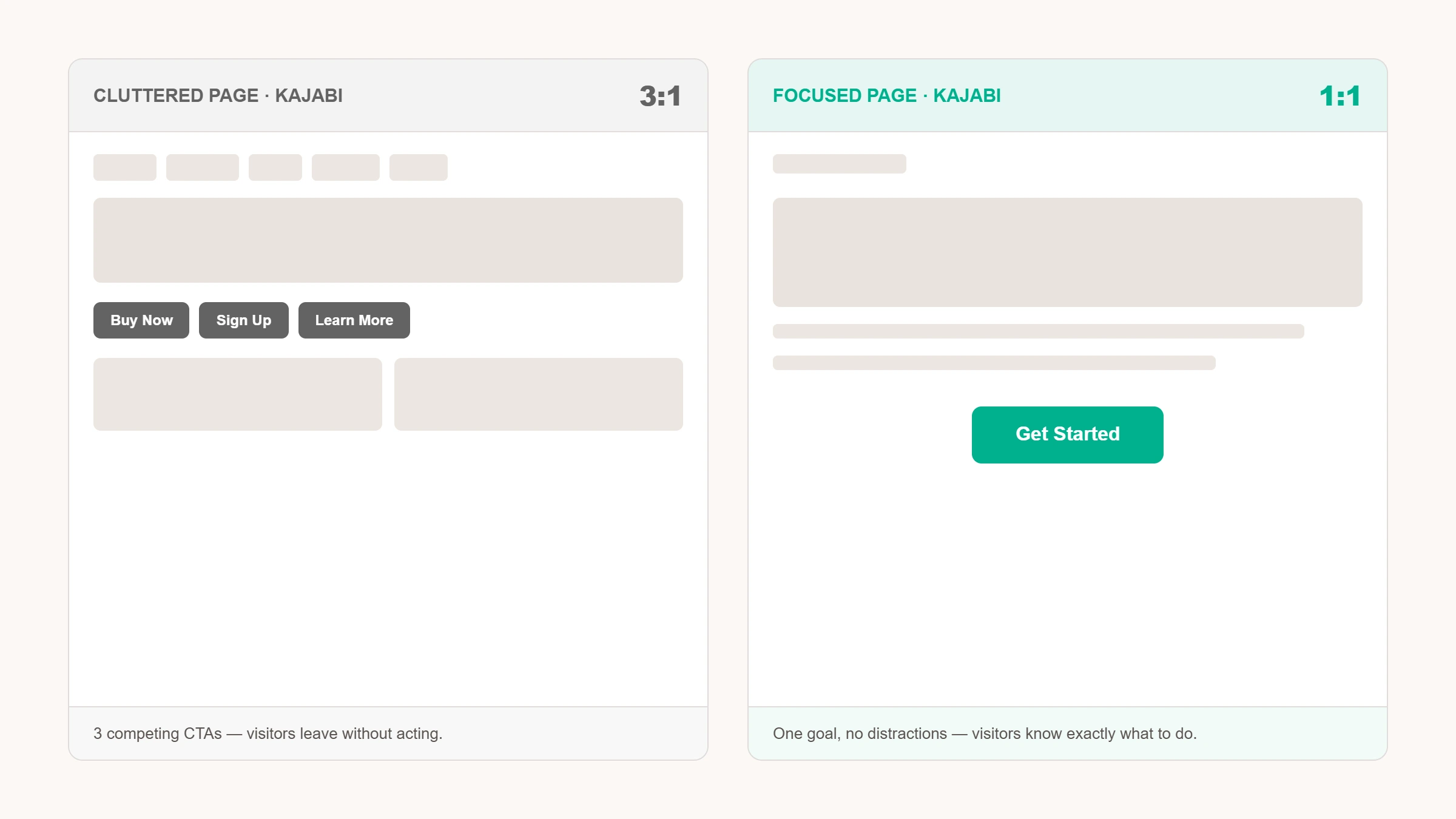
| Too many competing CTAs (or none) | Multiple actions fight for attention, or no clear next step exists at all | The attention-ratio test, aim for one primary action on sales and offer pages |
| Trust signals buried, missing, or generic | Testimonials sit at the bottom of a long scroll, or say things like "Great course!" instead of naming a result | The trust-signal test, a specific testimonial should be visible without scrolling past three sections |
| Navigation that doesn't match how visitors think | Menu is organized around the business internally, not how a new visitor thinks about their problem | Reorganize the menu around the visitor's problem, not your internal structure |
| Mobile experience treated as an afterthought | Pages only reviewed on desktop, so mobile has broken spacing or a hero message pushed below the fold | The mobile test, check the hero message shows above the fold on your own phone |
| Offer and page mismatch | An ad or email promises one thing, but the landing page doesn't closely echo it (weak message match) | The message-match test, click through from wherever your traffic actually comes from |
| Escape routes left open | Full nav menu, social icons, and outbound links sit on sales, offer, or checkout pages | The exit test, count every link that isn't the CTA on your sales and offer pages |
| Images that don't reinforce the message | Generic stock photos or decorative graphics don't build trust or clarify the offer | The image test, every image should either build trust or clarify the offer |
Swipe left/right to see the full table on mobile.
1. Unclear or generic messaging
If a visitor can't tell what you do, who it's for, and what to do next within about five seconds, they leave. "Transform your life" tells a visitor nothing. Your homepage headline is the single highest-leverage line of copy on the entire site, and the one most often left generic.
2. Too many competing CTAs (or none at all)
Some Kajabi sites have a "Book a Call," a "Join the Waitlist," a "Download the Freebie," and a "Shop Now" all fighting for attention on one page. Others have none, just a description and no next step.
Oli Gardner calls this your page's attention ratio: the number of things a visitor can do compared to the number of things you actually want them to do. A well-optimized landing page has a ratio of 1:1, one goal, one action. A homepage can reasonably run higher, but a sales or offer page with five competing buttons is fighting itself. Both too many CTAs and zero CTAs kill conversion for the same underlying reason: the visitor doesn't know what you want them to do.
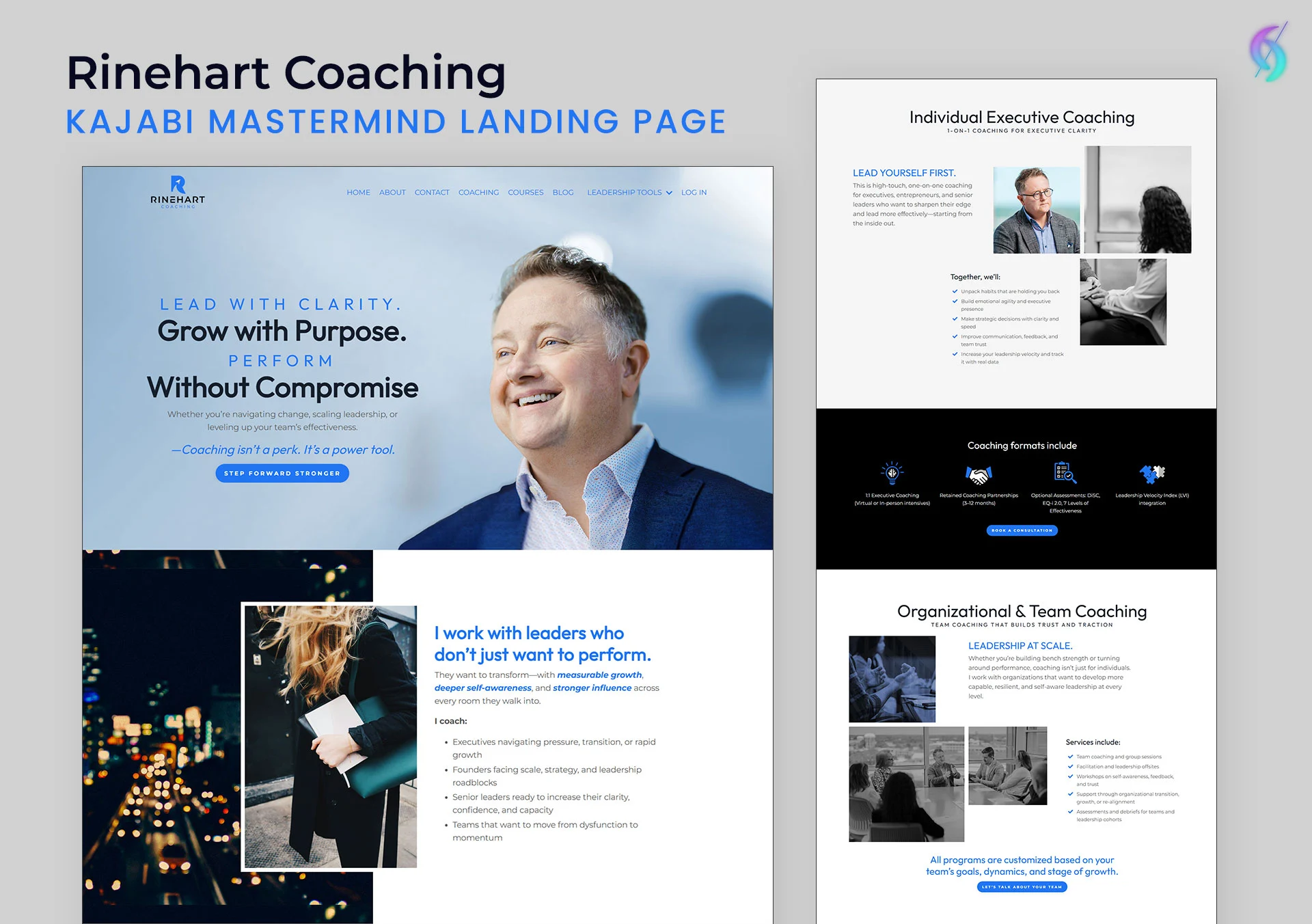
A real example: Rinehart Coaching's Kajabi site, built with a consistent CTA throughout, imagery that speaks directly to the audience, and specific, named testimonials.
3. Trust signals buried, missing, or too generic
Testimonials tucked at the bottom of a long scroll, credentials never mentioned, no visible proof of results, these quietly raise doubt at the exact moment a visitor needs reassurance. And not every testimonial does the same work: "Great course!" tells a visitor nothing, while a testimonial naming a specific result or transformation actively builds trust. If you have proof, be specific with it.
4. Navigation that doesn't match how visitors think
If your menu is organized around how you think about your business internally, rather than how a new visitor thinks about their problem, people get lost before they reach your offer.
5. Mobile experience treated as an afterthought
Most Kajabi traffic is mobile. A page only reviewed on desktop often has broken spacing, tiny tap targets, or a hero section that pushes your message below the fold.
6. Offer and page mismatch
Someone clicks an ad about your signature program and lands on your general homepage instead of a page built for that exact offer. Gardner has a name for this too: message match, how closely your landing page copy and design echo the ad, email, or link that brought someone there. Weak message match makes a visitor pause and wonder if they clicked the wrong thing, and that half-second of doubt is often enough to lose them. It's a strategy problem, not a design problem.
7. Escape routes you didn't mean to leave open
A full nav menu, social icons, and outbound links dropped into the middle of a sales or offer page all give a visitor a way to leave before they've acted, every one of them is a tiny exit sign next to your CTA. This matters most on the pages doing the actual selling: a sales page, an offer page, a checkout page. Strip the navigation down (or remove it entirely) on the pages where you have someone's full attention, and save the full menu for pages meant for browsing.
8. Images that don't reinforce the message
Generic stock photos, decorative graphics with no connection to the offer, or product and team photos that don't visually support what the page is asking someone to do, and this applies to every image on the page, not just the hero. Every image on a converting page should either build trust (real photos of you, your work, your client results) or clarify the offer (a screenshot, a mockup, a before/after), not just fill space. If you can't say what job a specific image is doing, it's probably competing for attention with your actual message instead of supporting it.
How to Audit Your Kajabi Website for Conversion
Before assuming you need a full redesign, run through this checklist:
- The outcome test: name the one thing this page is supposed to make someone do. Can't answer in one sentence? Neither can your visitor.
- The 5-second test: show your homepage to someone unfamiliar with your business for 5 seconds. Can they tell you what you do?
- The attention-ratio test: count the calls to action on the page. More than one primary action on an offer or sales page, simplify.
- The mobile test: open your own site on your phone, not just your laptop. Does the hero message show above the fold?
- The message-match test: click through from wherever your traffic actually comes from and see if the landing page matches what was promised.
- The trust-signal test: can a first-time visitor find a specific, credible testimonial or proof point without scrolling past three other sections first?
- The exit test: on your sales and offer pages, count every link that isn't the CTA, nav menu, social icons, footer links. Each one is a way out.
- The image test: does every image on the page either build trust or clarify the offer? If you can't say what job a photo is doing, it's probably just decoration.
Failing two or more of these? The problem usually isn't your visual design, it's structure and messaging.
Failed a few of these checks and not sure where to start fixing them?
Kajabi-Specific Things That Quietly Kill Conversion
Everything above applies to any website platform. Kajabi has its own settings, ones a generalist web designer wouldn't know to check, that can undercut an otherwise well-designed page. These are the ones I check on every audit:
- You're still on the legacy checkout. Kajabi's newer Enhanced Checkout is mobile-friendly and supports up to six order bumps on a single offer. Older offers may still be on the old template without you realizing it.
- Your post-purchase redirect goes nowhere useful. A generic default confirmation instead of a real welcome or next-step page wastes the moment a customer is most engaged.
- Your opt-in confirmation is a dead end. "Thanks, check your email" is a missed handoff, a page that says what happens next keeps momentum.
- Unoptimized images are slowing your page down. A full-resolution photo straight from your phone can be the difference between an instant load and an abandoned page. (This is separate from whether an image belongs on the page at all, see reason #8 above. This one's about performance, not purpose.)
- Your theme's mobile rendering hasn't actually been checked. Sections that look intentional on desktop can stack oddly on mobile, pushing your message below the fold.
- You can't see where people are dropping off. Without analytics or pixel tracking properly connected, you're troubleshooting blind.
- Your thank-you page is doing nothing. Instead of a plain "you're in!" message after a low-ticket purchase, Kajabi lets you redirect checkout to a custom landing page pitching a related, higher-ticket offer, often at a special rate. It costs nothing extra to set up and turns a dead-end confirmation into a second chance to sell, to someone who just proved they're ready to buy.
None of this shows up in a screenshot. It only shows up when someone who's worked inside the platform actually goes looking for it.
Design Fixes vs. Strategy Fixes: What Actually Moves the Needle
Some conversion issues are quick design fixes: moving a CTA higher, enlarging a tap target, adding a testimonial above the fold. Others require rethinking the page's structure entirely, which offer it's built for, what the visitor was promised before they clicked, what happens after they act.
For example: a sales page with three competing CTAs above the fold, "Book a Call," "Join the Waitlist," and "Download the Guide," was simplified to one primary action that matched the exact ad campaign sending traffic to it. No redesign, no new copy, no new photos. Just one clear next step instead of three, fixing the attention ratio, not the visuals.
This is where platform knowledge matters as much as design sense. A purely visual designer can make a page beautiful without knowing that a Kajabi form setting, offer configuration, or automation trigger is quietly working against the action they're trying to drive.
"I've been absolutely delighted with my collaboration with Dianne and the results of the project. Dianne built a complex sales page for me within a very reasonable timeframe, she was extremely knowledgeable about the Kajabi platform, her attitude very professional, she was communicating with me effectively, responding to my feedback and questions promptly and thoroughly. I am very grateful and I am receiving wonderful feedback to the sales page from my clients. I will definitely turn to Dianne again for future projects!"
— Nicole Carino
What to Do Next (And Why to Hire a Vetted Kajabi Expert)
Reading this is the easy part. Here's how to actually use it.
One or two things broken? Fix them yourself. A buried testimonial, a second CTA competing with the first, a redirect pointing at the wrong page, afternoon fixes inside your own Kajabi account.
Failed most of the audit, or not sure why a specific page underperforms? That's usually a conversion-focused redesign, not a full rebuild, and it's exactly the kind of problem a Kajabi expert catches faster than trial and error will.
Structure itself working against you, offers that don't match the pages promoting them, a site never built around how visitors actually move through it? That's a rebuild, not a patch.
This is exactly what I look at as a vetted Kajabi Expert: messaging, attention ratio, message match, trust signals, mobile behavior, and the Kajabi-specific settings above, all looked at together, not one at a time, because a page that's beautiful and a page that converts are only the same thing when both were planned for from the start.
Take a look at what's included in a Kajabi Website Design project, then reach out and let's talk through what your site actually needs, whether you're a coach, course creator, or entrepreneur.
Frequently Asked Questions
Why does my website look great but get no leads?
Usually because the design was optimized for how it looks, not for guiding a specific visitor toward a specific action. A beautiful site with unclear messaging, competing CTAs, or buried trust signals will still underperform.
Do I need a full redesign or just a conversion audit?
Not always a redesign. Many issues can be fixed by restructuring existing pages, simplifying CTAs, reordering sections, matching offer pages to traffic sources, without rebuilding the site. A short conversation about your specific site is usually the fastest way to know which one you need.
How do I know if it's a conversion problem or a traffic problem?
Landing and leaving quickly (high bounce, low time on page) is typically conversion. Very few people reaching the site at all is traffic, and no redesign fixes that. Different problems, different solutions.
Can I fix conversion issues without a full redesign?
Often, yes. Messaging clarity, CTA placement, trust-signal visibility, and offer-page alignment can usually improve within your existing design. A full redesign is worth it when the underlying structure, not just individual pages, is working against you.
What's a good conversion rate for a Kajabi website?
It depends on your offer and traffic source, a free opt-in page and a $2,000 program sales page convert very differently, and no single number applies to every business. What matters more than a benchmark is the trend: is it improving as you fix clarity and structure, or staying flat no matter what you change?
Can Kajabi's Cofounder AI help identify conversion issues?
It can surface surface-level signals, traffic, sales, drop-off numbers it already sees in your account. Diagnosing why a page isn't converting still takes a human read on clarity, trust, and structure. Treat it as a starting signal, not a replacement for having someone experienced actually look at your site.
Related Reading
- What Makes a Custom Kajabi Website Actually Custom (And Why It's Not Just Design)
- How to Choose the Right Kajabi Expert (And What to Ask Before You Hire)
The Author
Dianne Empeynado is a Kajabi Website Designer and vetted Kajabi Expert known for designing across a wide range of styles: feminine, modern, minimalist, editorial, bold, professional, corporate, and everything between, with every site structured around how the business actually works, not just how it looks. She's worked with coaches, course creators, and entrepreneurs since 2017, and was formerly on Kajabi's own Technical Support and VIP Implementation team, so every design she builds is backed by platform-level technical accuracy most designers don't have, including complex platform migrations, advanced automation builds, and conversion-focused funnel architecture that generalist designers typically don't take on. She was ranked the #1 Kajabi Expert in Kajabi's official Expert Directory before it closed and its network migrated to Contra. For projects that need deep copywriting or brand messaging strategy, she partners with trusted specialists from her Kajabi Experts Circle rather than stretching outside her lane.
That combination, real design range, structural thinking, and technical depth, is why she's a top-rated Kajabi specialist on Contra, a Fiverr Vetted Pro, available on Upwork, and a member of the Experts Circle, a peer-vetted network of Kajabi professionals.
What began as a solo website design business has become a creative studio, built to support creators, coaches, and entrepreneurs through more stages of their business, while keeping the same thoughtful, personal approach that's always mattered.
See the range for yourself in the portfolio, or start your Kajabi project here.