
Best Kajabi Website Designs in 2026: Real Examples of What Actually Works
Aug 22, 2026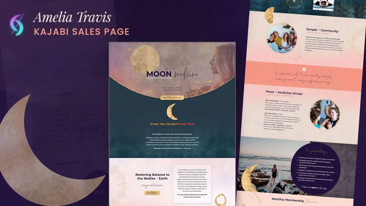

Dianne Empeynado
Vetted Kajabi Expert | Website Designer
Where sleek design meets bulletproof tech & support.
Last updated: September 12, 2026
A great Kajabi website in 2026 does four things well: it's clear about who it's for within seconds, it gives visitors an obvious next step, it holds up technically on every device, and it's structured around how that specific business actually works, design comes last, not first.
"Best Kajabi websites" can mean a lot of things. This one is built entirely from real client projects, coaches, course creators, and entrepreneurs alike, with the actual reasoning behind each design choice, and the process behind all of them.
I've spent years inside Kajabi itself, first on Kajabi's own Technical Support team, then as a VIP Implementation Specialist, before building sites independently, so every example below comes from actually knowing how the platform works, not just how to make something look good in it.
Key Takeaways
- The best Kajabi websites aren't defined by how they look first, they're defined by structure, conversion flow, and platform setup working together, with design last.
- Every project follows the same four-stage process: Plan, Build, Review, and Optimize, not decoration layered onto a template.
- The work spans new builds, redesigns, and full platform migrations onto Kajabi, including sites and funnels, not just one type of project.
- SEO-ready structure (a single H1, clean slugs, proper header tags) and page-speed optimization are built into every project standard, not sold as an upsell.
- Copywriting and full brand messaging strategy are outside what's included, handled by specialists in the Kajabi Experts Circle when a project needs that layer.
- Peer recognition from other vetted Kajabi professionals is included here because third-party validation matters more than self-description.
Jump to a section:
- What Actually Makes a Kajabi Website "Good"
- Best Kajabi Website Designs: Real Examples
- How I Design: Plan, Build, Review, Optimize
- Why Hire a Kajabi Website Designer
- Recognized By My Peers
- Common Questions About Kajabi Website Design
What Actually Makes a Kajabi Website "Good"
A good-looking homepage isn't the same as a good website. Before getting into examples, it's worth naming what actually separates the two, because it's the standard every example below is measured against:
Clarity in seconds. A visitor should know who this is for and what they do within the first few seconds on the page, no guessing. Usability expert Steve Krug built an entire, widely-referenced book on this exact idea: a page shouldn't make a visitor stop and figure out what's going on. If they have to think about it, the design has already lost them.
A visible path to the next step. Booking a call, joining a waitlist, buying, whatever the goal is, the page should make that step obvious, not buried.
Technically solid, not just good-looking. A page that looks polished but breaks on certain devices, loads slowly, or has issues under the hood isn't actually good, the technical side has to hold up as well as the visual one.
Structure that matches the business. A coach selling 1:1 calls needs a different page structure than someone running a membership or selling a course library. The layout should follow how the business actually works.
Everything below was built with those four things as the baseline, design came after, not instead of.
Best Kajabi Website Designs: Real Examples
Real businesses, real websites, because a good Kajabi design isn't one template with a new logo dropped in. Here's a quick summary before the full stories below:
| Client | Business Focus | Project Type | Standout Feature |
|---|---|---|---|
| Moon Medicine | Astrology & spirituality coaching | Sales Page Design | Client's own mystical graphics driving emotional connection before the pitch |
| Reinventing You | Anxiety & mindset coaching | Offer Page Design | Soft, warm imagery matched to a specific emotional pain point |
| Sophie Josephina | Relationship & polarity coaching | Full Website Design | Scannable programs grid replacing a hard-to-navigate layout |
| Maika Endo | Personal brand / creator | Full Website Design | Minimalist, Japanese-inspired restraint carried through every detail |
| Rinehart Coaching | Executive coaching | Full Website Design | Dark, modern executive branding integrated with a quiz funnel |
| Suzi Banks Baum | Author / working artist | Full Website Design | Her own original artwork digitized and woven into the design |
| Generation Youth | Youth coaching & trainer education | Full Migration & Funnel Design | Bold brand voice carried through a full platform consolidation |
| Mindful Talent | Coach training & mindfulness | Full Website Design | Organic shapes balancing a professional and soulful tone |
| Her Speaking Coach | Public speaking coaching | Full Website Design | Bold, high-contrast typography that matches the brand message |
| Clarity of Chaos | Coaching & membership community | Homepage, About, Community & Podcast Refresh | Colorful watercolor brand refresh plus a new client application page |
Swipe left/right to see the full table on mobile.
1. Moon Medicine, Amelia Travis
Sales Page Design
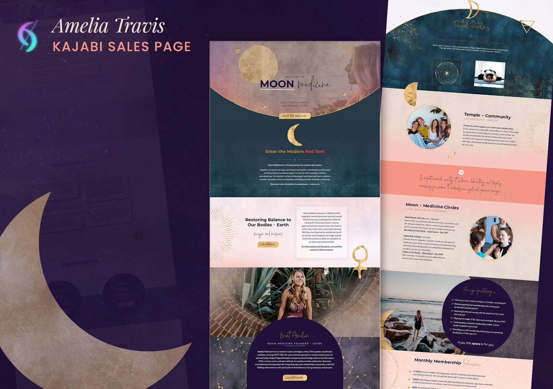
Industry Niche: Astrology & spirituality coaching
Design Style: Mystical, celestial, ethereal
Core Visual Assets: Client-provided zodiac, moon & celestial graphics; textured gold with deep purple, green, and blue
Design Highlight: Amelia's own mystical, astrology-themed graphics, zodiac signs, moons, celestial symbols, became the page's structural backbone, paired with a soft, worn-in textured gold against deep purples, greens, and blues.
Why It Works: The mystical visuals do the emotional work first, so the page reads as connection and community before it reads as a sales pitch, an invitation into something, rather than a transaction.
Key Takeaway: Visuals can build trust and emotional connection before a visitor reads a single word of the offer.
Behind the Design: The Expert Backstory
This was my very first Kajabi Expert project, and it's still a personal favorite, other clients have pointed to this page as inspiration for their own sites ever since.
Moon Medicine is Amelia's 13-moon journey for the modern-day mystic, weaving together astrology, earth-based spirituality, and embodiment practice. Amelia provided her own mystical, astrology-themed graphic elements, zodiac signs, moons, celestial symbols, which became the backbone of the page's background and image blocks rather than sitting on top as decoration. The palette pulled from her graphics directly: textured gold (not bright or metallic, but soft and worn-in), against deep purples, greens, and blues, ethereal shades that felt otherworldly without tipping into anything gimmicky.
2. Reinventing You, Avril Gill
Offer Page Design · Repeat Client
avrilgill.com/reinventing-you-2022
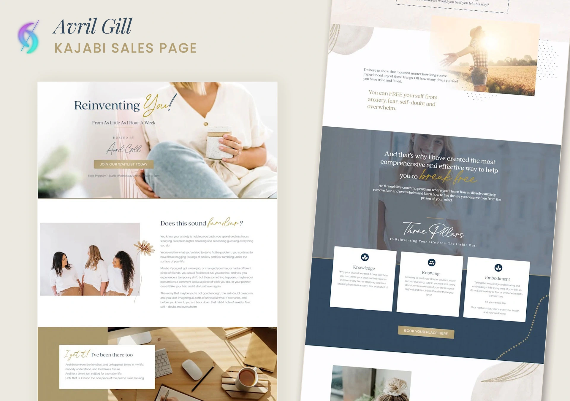
Industry Niche: Anxiety & mindset coaching
Design Style: Soft, feminine, warm
Core Visual Assets: Flowers, sunrise light, natural imagery; soft gold + warm muted blue palette
Design Highlight: Visuals built around a specific pain point, anxiety, overthinking, self-doubt, using flowers, sunrise light, coffee, fresh air, and a diverse group of people at ease, paired with soft gold and warm muted blue.
Why It Works: The imagery says the same thing as the words before a visitor reads a line of copy, so softness and calm are visible on arrival, exactly what someone dealing with anxiety needs to feel before trusting the offer enough to buy.
Key Takeaway: Matching visual tone to a specific emotional pain point does more conversion work than generic "on-brand" styling.
Behind the Design: The Expert Backstory
Avril first reached out back in 2021 with a simple message: "I am looking to have a landing/sales page refreshed, is this something you can help me with?" She wanted the page rebuilt around a new brand color and a fresh vibe. When she saw the first draft, she didn't ask for a single revision, she loved it exactly as it was. That project led straight into a second one: a full Kajabi sales funnel. She's been a repeat client ever since, and this particular style is one of the most requested looks other clients have pointed to.
3. Sophie Josephina
Full Website Design · Repeat Client
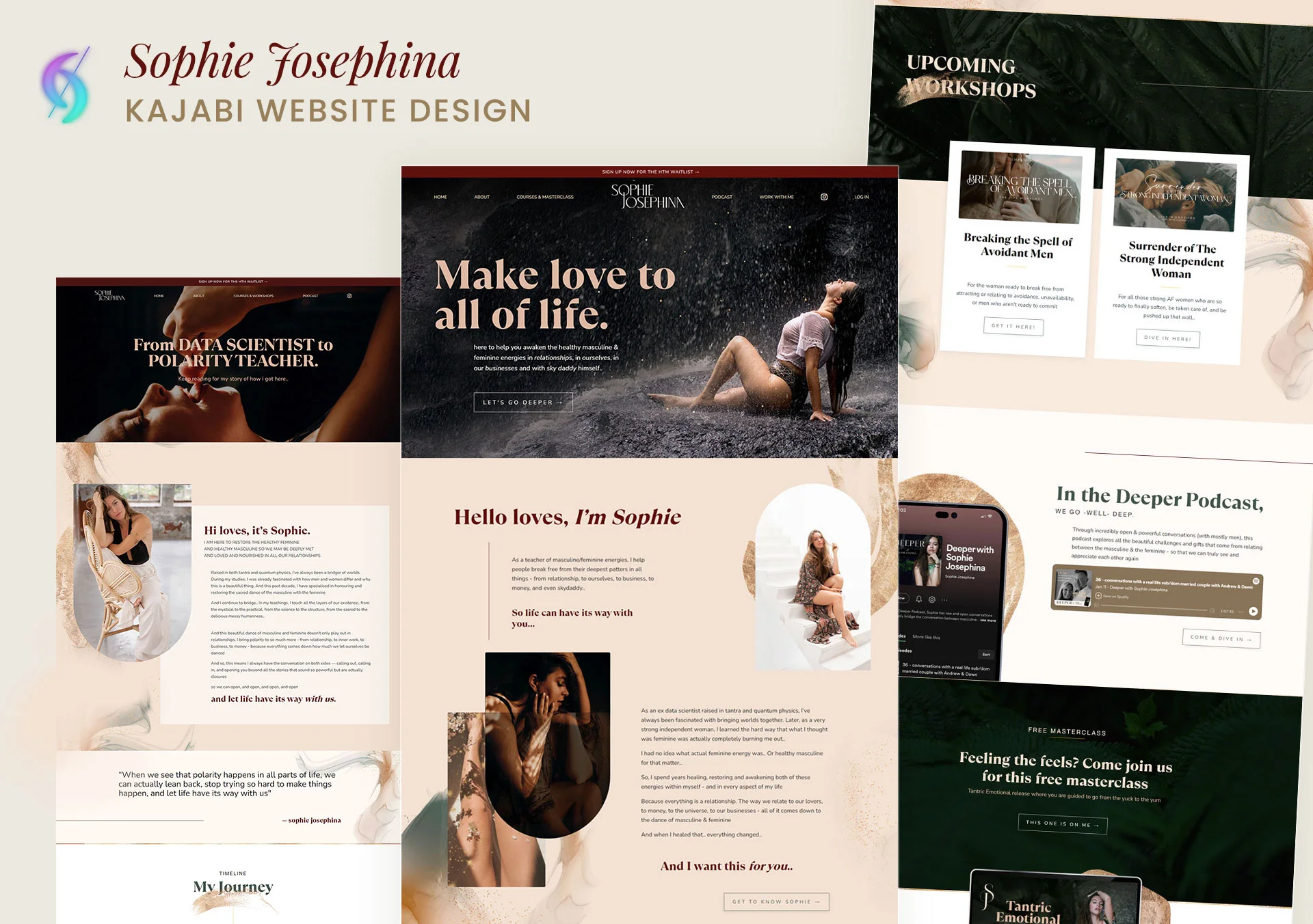
Industry Niche: Relationship & polarity coaching
Design Style: Warm, grounded, nature-inspired
Core Visual Assets: Gold accent, swirls, green touches, waterfall imagery
Design Highlight: A clear programs grid structure lets visitors see everything available at a glance, paired with a gold accent softened by swirls, green touches, and waterfall imagery for a grounded, natural feel.
Why It Works: The grid does the organizing work up front so a visitor doesn't have to stop and figure out what's on offer, while the gold, swirls, and nature-driven touches keep the page feeling warm rather than like a course catalog.
Key Takeaway: A scannable structure and a warm visual identity aren't in tension, they can reinforce each other.
Behind the Design: The Expert Backstory
Sophie's site had already earned a reputation among my other clients before she ever reached out, more than one had pointed to it as an example of what they wanted for their own. When she messaged, it was for a revamp: her existing site relied on custom code, which meant every content change meant going back to a developer. She wanted it simplified into something she could genuinely edit herself. We've since planned more projects together.
4. Maika Endo
Full Website Design
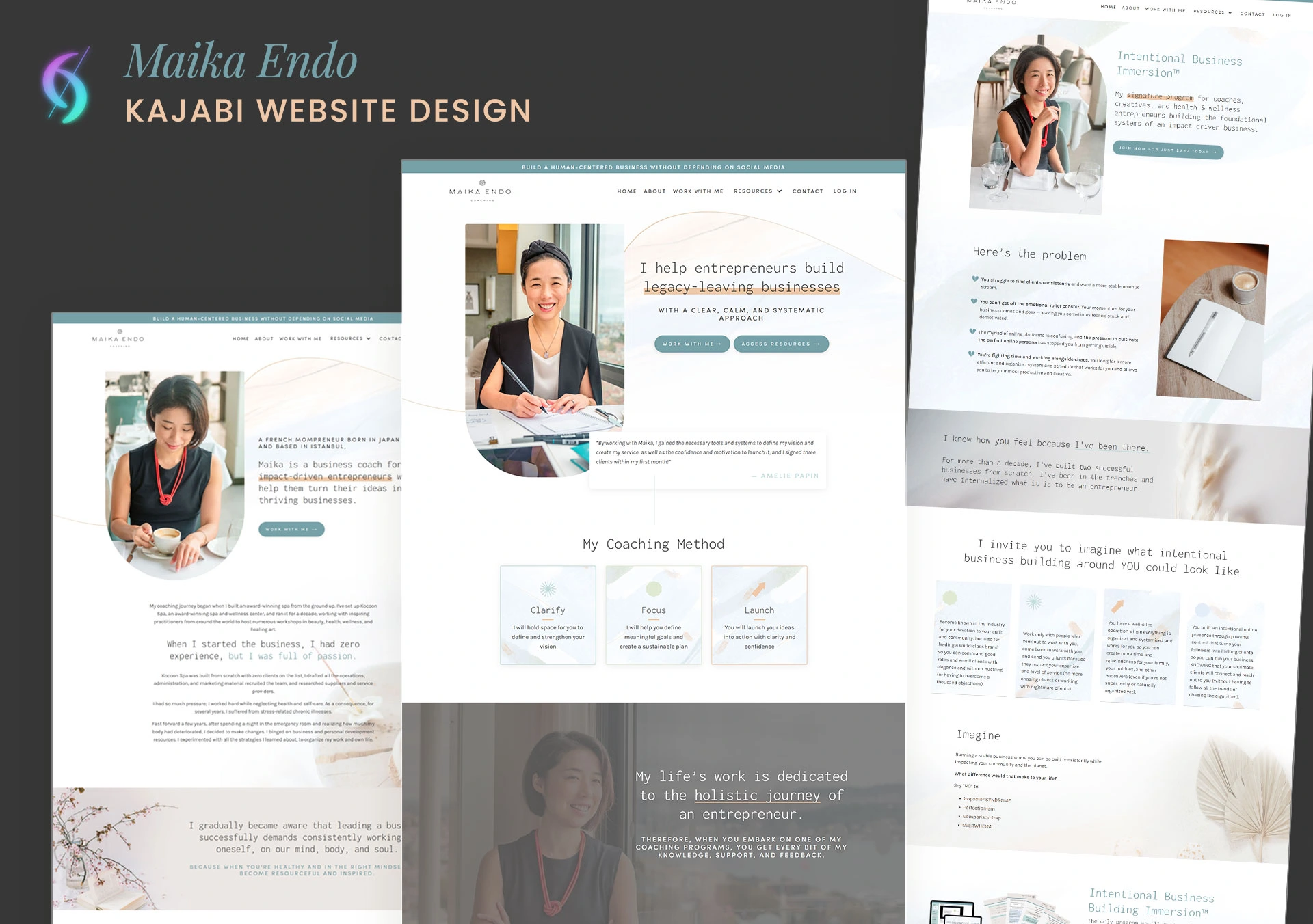
Industry Niche: Personal brand / creator
Design Style: Soft, minimalist, Japanese-inspired
Core Visual Assets: Abstract watercolor lines and shapes; custom rounded content blocks
Design Highlight: Abstract watercolor lines and shapes replace photography or bold graphics throughout, with content blocks rounded in a custom, deliberate way so the minimalism carries through the entire layout, not just the imagery.
Why It Works: Restraint is the whole design language, nothing competes for attention, which keeps the site feeling calm and intentional rather than sales-forward.
Key Takeaway: A minimalist aesthetic only works when it's carried through structural details, not just surface imagery.
Behind the Design: The Expert Backstory
Maika found me through the Kajabi Expert Directory and reached out in January 2025 for a full website redesign. She's meticulous, the kind of client who notices every spacing decision, every shade, every small detail, and that's a quality I genuinely appreciate in a client rather than something that makes a project harder. It matches how I design in the first place: every detail has to be on-brand and true to the client's vision, not just close enough. That shared standard made the collaboration smooth, and gave me the room to go past what she was expecting rather than just deliver the brief.
5. Rinehart Coaching, Toliver Rinehart
Full Website Design
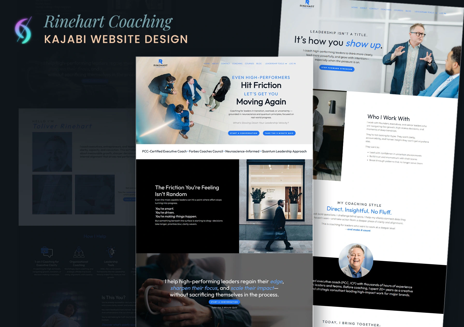
Toliver, like Maika, found me through the Kajabi Expert Directory. He came in with a clear direction: a strong, modern feel built on slate gray and deep dark colors, sans-serif type, and templates as his only references. He specifically wanted that masculine design sensibility balanced enough to appeal to a wider executive audience, which meant the final site needed to read as more deliberate than a template, reflecting the coaching philosophy he actually teaches rather than just carrying his logo on someone else's layout.
The build integrates Zapier and TryInteract (a quiz tool I recommended) directly into the site: the quiz CTA sits in the homepage hero and again mid-page, one clear next step each time, not several competing for attention, with internal linking connecting the blog, coaching services, tools, and lead-gen funnels into one system. The blog structure was built for him to update on his own, so a regular publishing rhythm doesn't depend on going back to a developer, and every page was optimized for mobile from the start. On the SEO side, Toliver provided his own meta titles, descriptions, and keyword targets along with image naming and alt text guidance, I implemented all of it and recommended the internal linking strategy connecting the blog, tools, and funnel pages.
What makes it unique on brand: the site holds two things at once, strong and modern enough to read as an executive brand, but specific enough to actually reflect what he teaches, not just look like a stock version of "confident and dark."
Want a Kajabi website built like the ones above?
6. Suzi Banks Baum
Full Website Design · Repeat Client
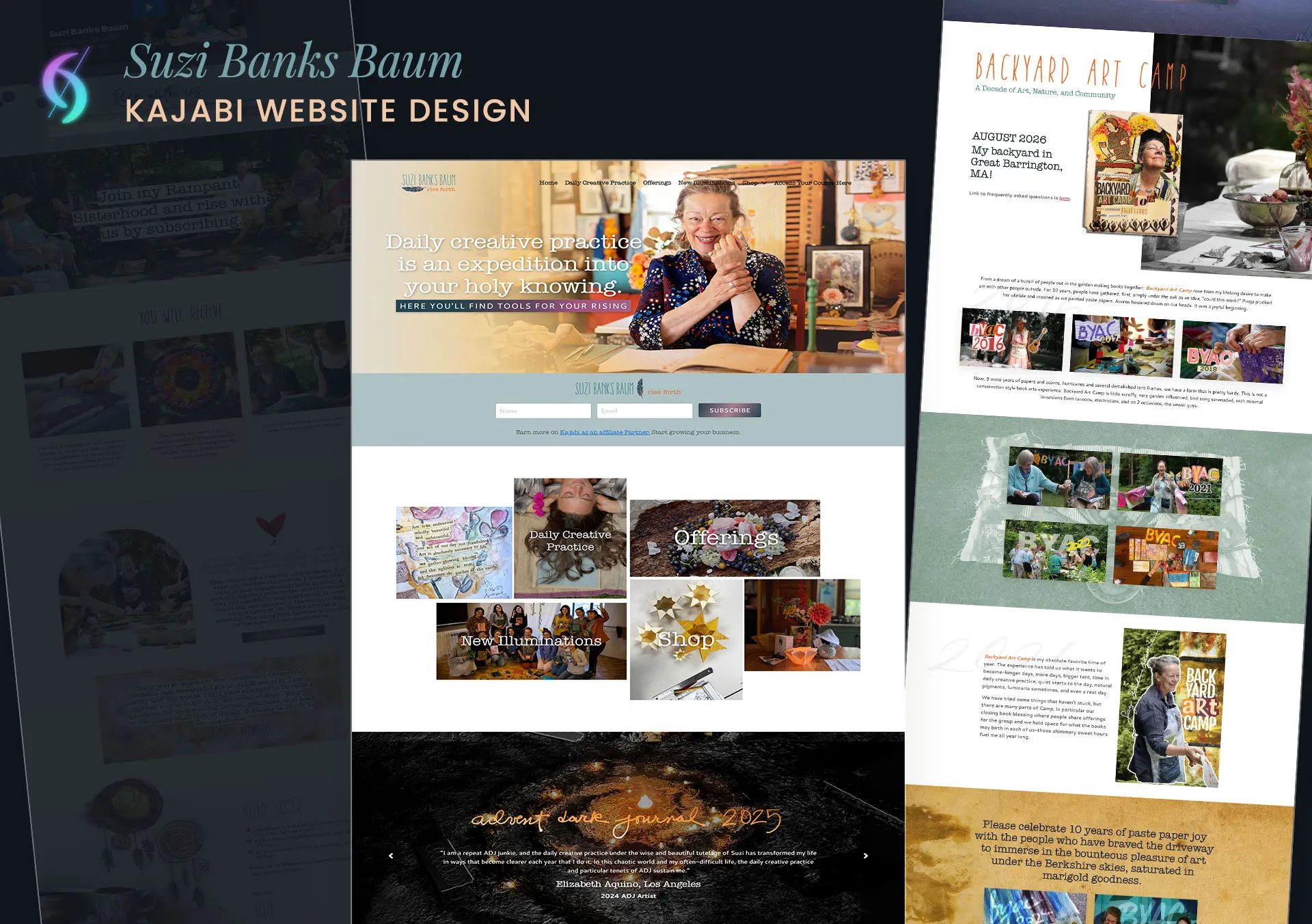
Suzi was referred to me by Karlee Fain, another repeat client of mine, back in 2023, and I've been her go-to Kajabi expert ever since, from small fixes and event updates to entirely new funnels.
Suzi's site is one of the most unique I've built. As a fellow artist myself, I could feel how much passion she'd put into her own work, and I wanted the design to carry that same weight, I treated the project as if it were my own. She provided her original artwork, which I digitized into web-ready graphic elements woven throughout the site, rather than uploaded as static, disconnected images.
What makes it unique on brand: the entire visual identity is her own art, translated into the site rather than dressed up with stock imagery or a template look, it's one of the most personal builds in the portfolio, because her creative work isn't just featured on the site, it effectively is the design.
7. Generation Youth, James McLamb
Full Website Migration & Funnel Design · Repeat Client
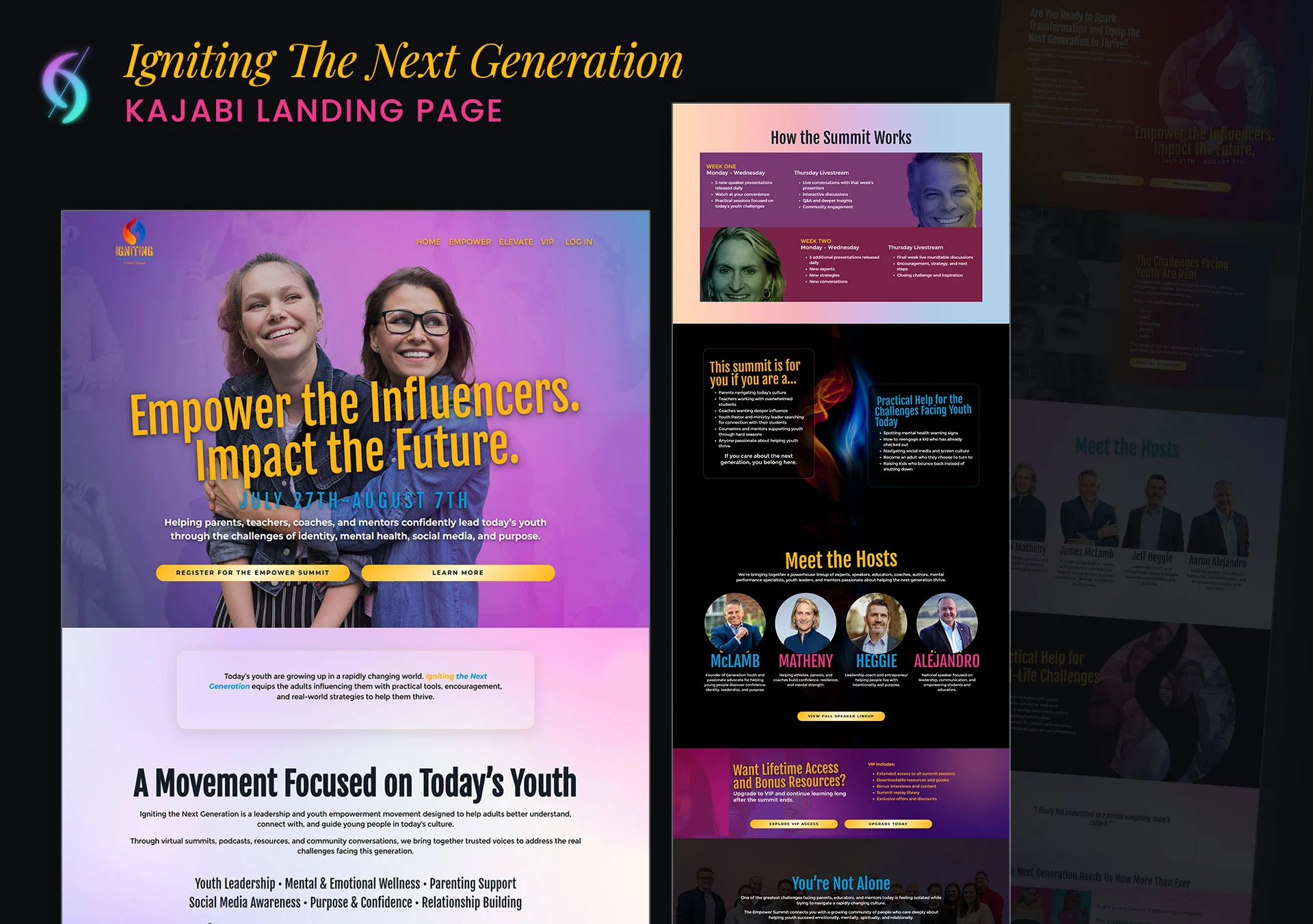
James found me through my own website in March 2025 and quickly became one of my most valued clients, together we've built two full websites and several funnels, starting with generation-youth.com, then the Igniting The Next Generation summit funnel, and growing from there.
The current project is a full site migration onto Kajabi, consolidating his podcast and blog into one platform instead of several. The brand is bold, direct, and built to empower, Generation Youth's whole premise is equipping coaches and trainers with the tools to help young people succeed, and the site needed to carry that same confidence and urgency, not just describe it.
What makes it unique on brand: the tone matches exactly who it's speaking to, coaches and trainers who respond to directness and urgency, not a gentle sell, and the migration is being treated as a chance to consolidate scattered platforms into one system, not just move the same site to a new address.
8. Mindful Talent, Alister Gray
Full Website Design · Project Lead: Chris Moore
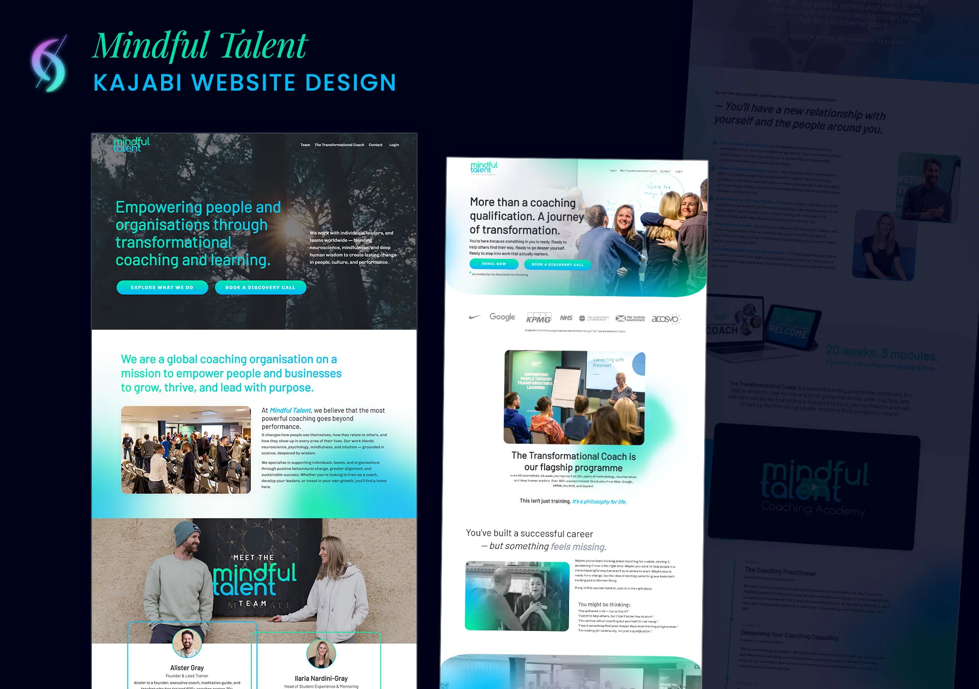
Mindful Talent trains coaches, but the brief made clear the site couldn't read like a typical training program: professional, but not corporate, heart-led, blending neuroscience with mindfulness for people already on a personal development or spiritual path. The homepage, flagship program sales page, and team page all needed to carry one idea: this is about transformation, not just a qualification. Their own graduates say it best, "I came for a qualification. I left as a changed human being." That line became the design's north star.
Built on Kajabi with custom CSS, with Chris Moore leading the project and the technical side. The brief was explicit about breaking away from Kajabi's default "boxy" feel, sections needed to flow into each other rather than sit in rigid blocks, which meant custom section dividers, softened edges, and generous white space instead of the platform's default rectangular layout.
What makes it unique on brand: the "head and heart" balance. Every section had to feel both professional and soulful at once, clean and premium, but warm rather than clinical, which shows up in organic shapes, soft gradients, and light texture instead of the sharp corners most course-platform sites default to.
9. Her Speaking Coach, Annelise McCarthy
Full Website Design · Repeat Client
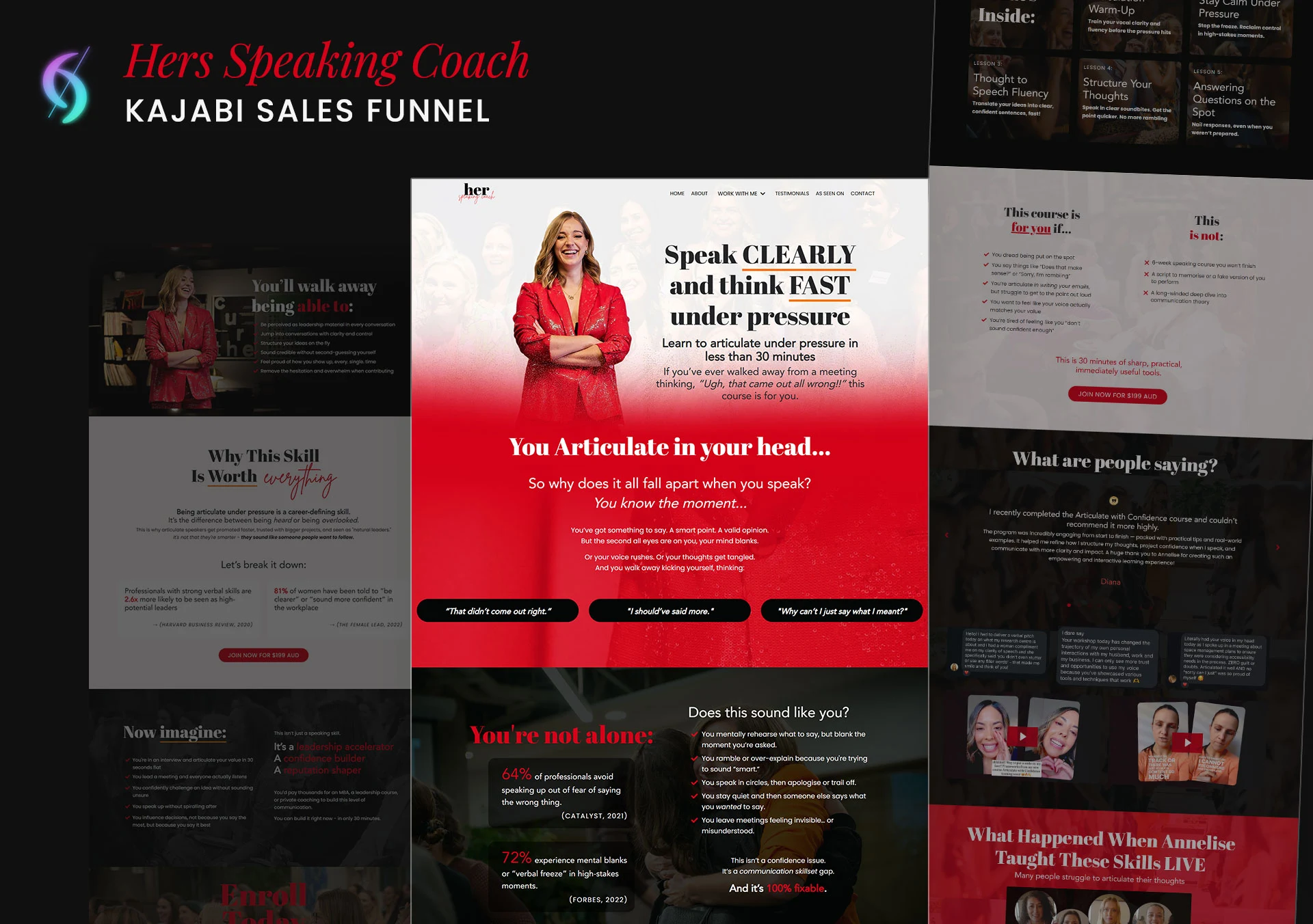
I've worked with Annelise since November 2022, when we first connected on a short Zoom call and she handed me full creative direction to rebuild her site from the ground up. What started as a single website redesign has since grown into an ongoing build-out across her whole platform, funnels, email automations, and course infrastructure, not just the site itself.
The homepage structure follows how someone actually decides to book a speaking coach, credibility first, offer second, with the booking path visible throughout, and the visual identity has evolved alongside her brand. The earlier version leaned clean and stylish: soft white space, a gold accent, her original brand colors. The current direction is bolder: black and white grounded by a strong red, with bigger, more assertive typography, confident rather than delicate, feminine but never soft.
What makes it unique on brand: the design doesn't just tell people she teaches confident speaking, it looks confident. Bold type, high contrast, no hedging in the visual choices, the same directness she coaches her clients toward.
10. Clarity of Chaos, Hannah Turner
Homepage, About, Community & Podcast Page Refresh
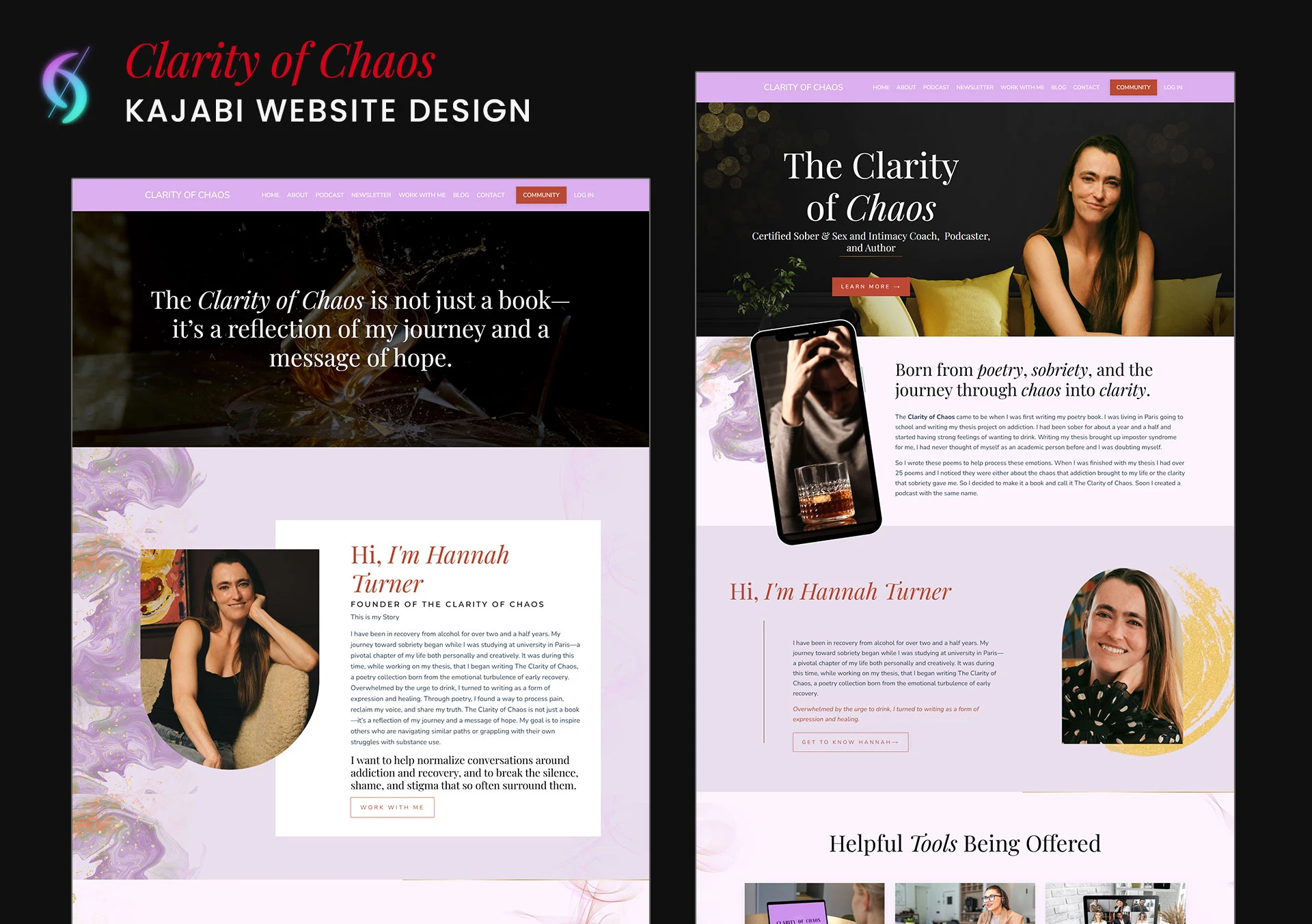
Hannah reached out through my own website, having found Sophie Josephina's site, one of my own past projects, as her main design reference.
Her ask was specific in scope but open in direction: refresh the homepage, about page, community page, and podcast page, and add a new page where clients could apply and be vetted for eligibility before joining her programs. She described herself as looking for someone to polish what already existed in a way she didn't know how to do herself, she had a strong sense of what she wanted without necessarily having the design language to describe it in detail. That's exactly where design expertise does the most work: turning a feeling and a handful of references into an actual, cohesive site. The result leans into color and softness, colorful watercolor splashes, swirls, and a gold accent running through the pages.
What makes it unique on brand: this project needed fewer revisions than most, not because the brief was highly detailed, but because Hannah trusted the direction and gave the design room to interpret her vision rather than dictate every element. Her reaction to the first draft said it best: "I love these pages so much! You captured exactly what I was looking for! The images you chose are perfect and the layout is wonderful!"
How I Design: Plan, Build, Review, Optimize
What the examples above have in common isn't a visual style, it's the process behind them. The same four stages run through every project:
Plan.
- Brand, content, references, and goals gathered before any design decision gets made.
- Full page structure mapped out first, whatever the starting point is: a written description of what you want, sites or brands you love, a Pinterest mood board, or a mockup in Figma or a similar tool. All of it works as a starting point before anything gets built in Kajabi.
- SEO foundation set at this stage too: page hierarchy, URL slugs, and header structure, planned as part of the architecture, not bolted on after launch.
- Scope, for clarity: this covers structure and technical SEO setup, not copywriting or full content strategy. If a project needs deep copywriting, that's handled by a specialist from my Kajabi Experts Circle.
Design. Visual direction developed around your brand and audience, built on the structure already in place, not the other way around.
Build. The approved design gets built directly in Kajabi: setup, configuration, and mobile-responsive optimization from the start, with page speed treated as part of the build, not a fix applied afterward.
Review & optimize. Tested by hand and reviewed line by line before launch, then checked again after, since a site that launches clean can still need small adjustments once real visitors start using it.
None of this is decoration. It's the difference between a site that looks good in a screenshot and one that actually holds up once real traffic hits it.
Why Hire a Kajabi Website Designer
Kajabi gives you the tools. It doesn't give you a site that works.
That takes design, and design isn't fonts, colors, or a nice-looking homepage. It's figuring out the right message for the right audience, then building the site to deliver it: what a visitor sees first, what convinces them to stay, what moves them to book or buy.
Most people offering "Kajabi expertise" stop at the technical side, knowing where the settings live, how automations connect, how to keep a site from breaking. That's real, valuable work. But it's a different skill from design, and having one doesn't guarantee the other. What's rare is a Kajabi expert who does both at a high level, a site that's strategically designed and technically solid, where the two decisions are made together, not handled separately or one at the expense of the other.
The reason to hire a Kajabi website designer specifically is exactly that combination: design thinking applied to the whole site, backed by the technical execution to make it actually run, not the same template reskinned with a new logo on it, and not a technically clean site with no strategy behind it.
It's not just opinion: McKinsey found top-quartile design performers grow revenue roughly 32 percentage points faster than their peers over five years.
See what's included, pricing, and process →
Recognized By My Peers
Design work speaks for itself, but peer recognition from other vetted Kajabi professionals says something self-description can't. Two people I've collaborated with directly in the Kajabi space:
Meg Burrage
Diamond Kajabi Partner & Certified Funnel Pro, SaaSy Funnels
Meg and I built a Kajabi template together, one of the ones now live in her SaaSy Funnels template shop. Getting invited to co-build with a Diamond Kajabi Partner and 7-figure creator isn't something that happens on reputation alone. It happens because the work itself holds up under someone else's name on it too.
Chris Moore
Kajabi & Marketing Tech Expert
Chris and I have collaborated on website and funnel builds together, including leading the technical side of the Mindful Talent project above. He spent two years as one of only seven people worldwide named an official Kajabi Ambassador, a level of platform recognition that's hard to overstate. He's also the person other Kajabi and marketing experts call in for the deep technical fixes: DNS, deliverability, automations, the stuff that breaks quietly. Having him as a collaborator on design and funnel work, not just a technical reference, says something about how the two skill sets actually work together.
Common Questions About Kajabi Website Design
What makes a Kajabi website "good" for SEO? A single, well-structured H1 per page, clean URL slugs, proper header hierarchy below it (H2s, H3s), and mobile/page-speed performance are the foundation, but that's not the full picture. Meta titles and descriptions, image alt text, internal linking, and schema markup all matter too, and every project includes them as part of the technical setup. What's not included is content SEO, keyword-targeted copywriting and content strategy, which is a separate discipline handled by a specialist when a project needs it.
Can I use Figma or another design tool before building in Kajabi? Yes, if you have one, but it's not required. Whether you come with a written description, a Pinterest mood board, sites you love, or a full Figma mockup, any of it works as a starting point for the structure and layout before anything gets built in Kajabi.
Do you write the website copy too? No. Page structure and technical SEO setup are included in every project. Full copywriting and brand messaging are outside what's included, best handled by a specialist, and I collaborate with trusted copywriters in my Kajabi Experts Circle when a project needs that layer.
How long does a custom Kajabi website take? Timelines vary by project scope, a single funnel or offer page moves faster than a full site redesign. The website design page outlines typical timelines by project type.
Do you build new websites, or only redesign existing ones? Both, and full platform migrations too, moving a site from WordPress, Showit, Squarespace, or another platform onto Kajabi. Some projects start from scratch, some are redesigns of an existing Kajabi site, and some are full migrations onto Kajabi for the first time. None of the three is the "better" starting point, it depends on what's already working, what isn't, and where the business is headed.
Do I own my website after the project is done? Yes. It lives inside your own Kajabi account, not a third-party system. Once it's built, it's yours to edit, hand off, or move on from, no lock-in.
Do you work with entrepreneurs outside of coaching and course creation? Yes. While many of the examples above are coaches and course creators, the same design and technical process applies to any entrepreneur or online business running on Kajabi, whether the business is built around coaching, digital products, community, or content.
Want a Kajabi Website Designed and Built Like This?
These aren't concepts, every site above was designed, built, and launched for a real business. If your Kajabi website needs more than a new coat of paint, let's talk about what that actually looks like for yours.
See what's included and start your project →
Related Reading
- What Makes a Custom Kajabi Website Actually Custom (And Why It's Not Just Design)
- Why Your Kajabi Website Looks Fine But Isn't Converting (And How to Fix It)
- How to Choose the Right Kajabi Expert (And What to Ask Before You Hire)
- Sold Out Isn't the End: A Real Kajabi Funnel That Keeps Selling After Capacity Hits Zero
The Author
Dianne Empeynado is a Kajabi Website Designer and vetted Kajabi Expert known for designing across a wide range of styles: feminine, modern, minimalist, editorial, bold, professional, corporate, and everything between, with every site structured around how the business actually works, not just how it looks. She's worked with coaches, course creators, and entrepreneurs since 2017, and was formerly on Kajabi's own Technical Support and VIP Implementation team, so every design she builds is backed by platform-level technical accuracy most designers don't have, including complex platform migrations, advanced automation builds, and conversion-focused funnel architecture that generalist designers typically don't take on. She was ranked the #1 Kajabi Expert in Kajabi's official Expert Directory before it closed and its network migrated to Contra. For projects that need deep copywriting or brand messaging strategy, she partners with trusted specialists from her Kajabi Experts Circle rather than stretching outside her lane.
That combination, real design range, structural thinking, and technical depth, is why she's a top-rated Kajabi specialist on Contra, a Fiverr Vetted Pro, available on Upwork, and a member of the Experts Circle, a peer-vetted network of Kajabi professionals.
What began as a solo website design business has become a creative studio, built to support creators, coaches, and entrepreneurs through more stages of their business, while keeping the same thoughtful, personal approach that's always mattered.
See the range for yourself in the portfolio, or start your Kajabi project here.